Visualizing a provenance graph with Gephi
Gephi is an open-source and free tool developed to visualize and explore graphs and networks, and supports the visualization of graphs stored in the GEXF format.
We can follow the instructions of the External tools for provenance visualization section on the Alpaca Installation section, for instructions on how to download and setup Gephi.
Loading the GEXF file
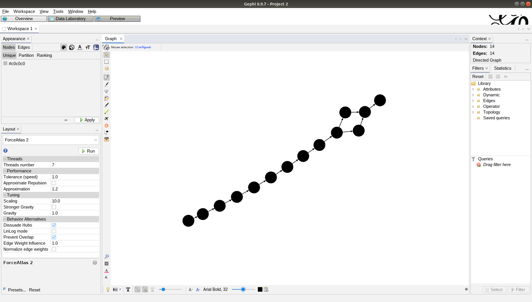
To visualize the graph, use the Open command:
Go to File->Open…;
Select the GEXF file that you saved with the visualize_prov.py script.
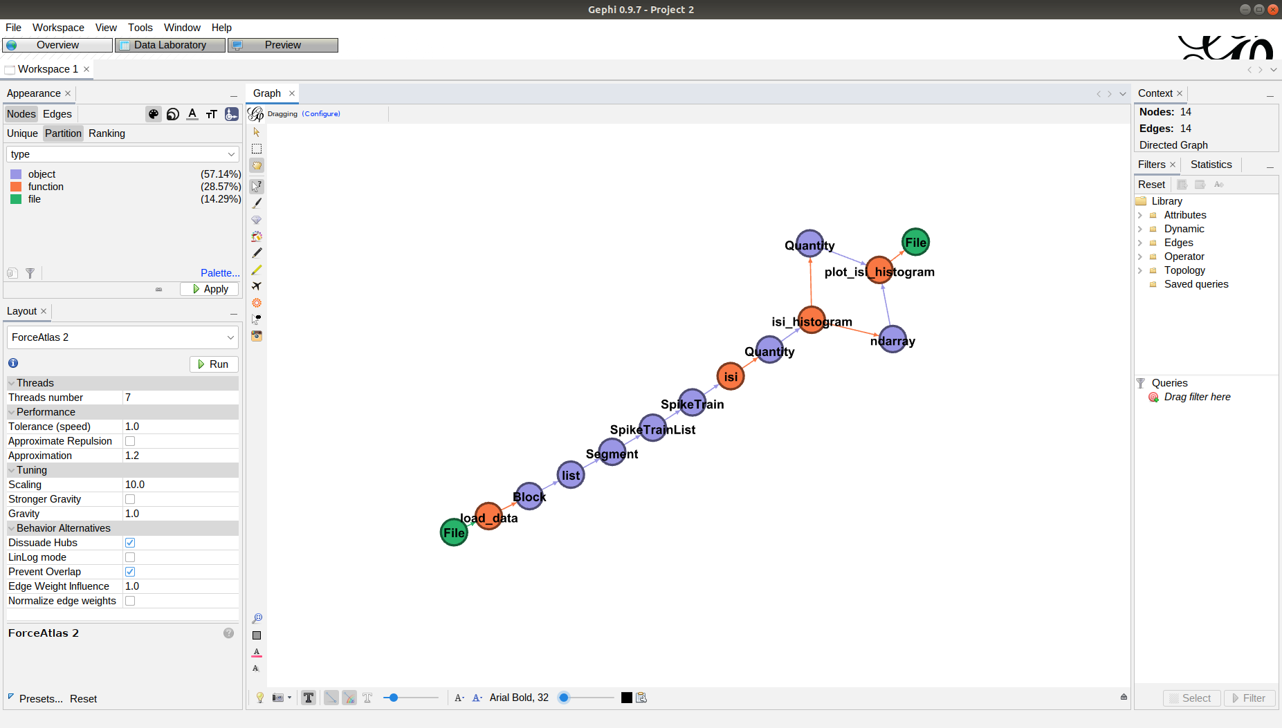
You will end up with the graph loaded in the main screen of Gephi:

Adjusting the graph layout
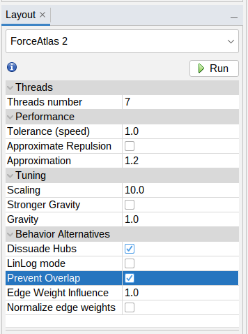
The graph can be sorted and organized using one of the layout algorithms. We recommend Force Atlas 2:
Select Force Atlas 2 from the drop-down list at the Layout panel on the bottom left;
Mark the options Prevent Overlap and Dissuade Hubs on the Behavior Alternatives section;
Press Run. After a few seconds, the graph will be sorted. Press Stop.
Adjusting the graph visualization
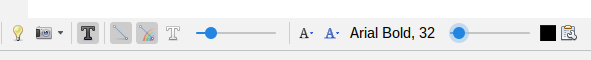
You can zoom in/out using the mouse wheel. You can drag the graph by pressing and holding the right button while moving the mouse.
You can tweak the graph appearance by displaying labels and using different colors for the nodes, according to their type:
Enable labels using the button at the bottom toolbar;
Select a good font size using the slider.
Color the nodes using the partition function:
At the Appearance panel on the top left, select the Partition tab inside the Nodes panel.
From the drop-down list, select type property, and click Apply at the bottom of the panel.
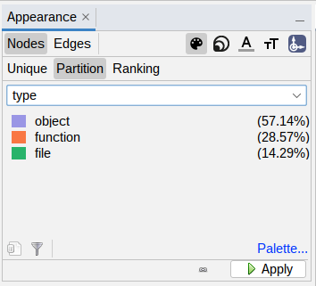
You will see the sequence of functions called (orange nodes) and the Python objects (purple) or files (green) used/generated by each function.
Inspecting provenance information
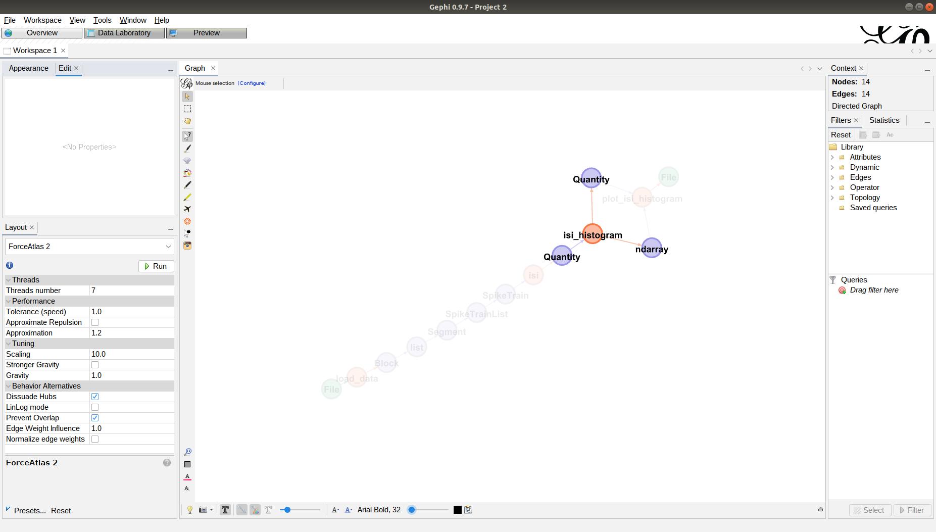
You can use the Edit - Edit Node attributes tool to display the properties of each node in the Edit panel at the top left.

Understanding provenance
Let’s take one of the function calls in run_basic.py:
isi_counts, isi_edges = isi_histogram(isi_times)
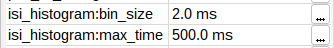
This is represented in the graph by the isi_histogram node:
Inspecting isi_histogram we can see the parameters used (that were the defaults in the function call):
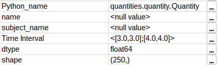
We can also inspect the two result objects:
1. The ndarray object contains the counts (i.e., an integer array with shape (249,));
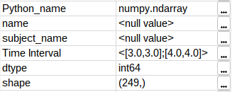
2. The Quantity object contains the histogram edges (float array with shape (250,)).
Therefore, the generated histogram has 249 bins.